티스토리 뷰

justify-content:
flex로 지정된 container 내부에 있는 item들을 주 축(main-axis)을 기준으로 정렬하는 방법입니다.
방법은 총 5가지로 아래와 같습니다.
1. justify-content: flex-start; (default)
2. justify-content: flex-end;
3. justify-content: center;
4. justify-content: space-between;
5. justify-content: space-around;
하나씩 설명하면서 예제를 보여드리도록 하겠습니다.
우선 기본 HTML과 CSS 입니다.
/* CSS */
.container {
  border: 4px solid;
  display: flex;
  justify-content: ;	/* 이 부분에 위의 옵션이 들어갑니다. */
}

.container .item {
  width: 100px;
  height: 100px;
  background: tomato;
  border: 4px dashed red;
  border-radius: 10px;
}
<!-- HTML -->
<div class="container">
<div class="item">A</div>
<div class="item">B</div>
<div class="item">C</div>
<div class="item">D</div>
</div>
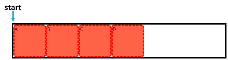
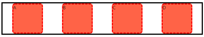
justify-content: flex-start; (default)
flex로 지정된 박스의 주축이 되는 부분의 시작점에서부터 item을 정렬합니다.
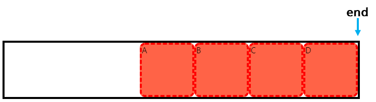
justify-content: flex-end;
flex로 지정된 박스의 주축이 되는 부분의 끝에서부터 item을 정렬합니다.
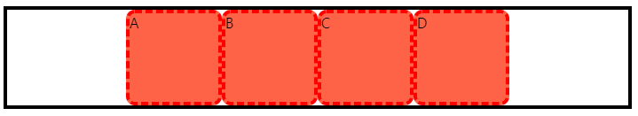
justify-content: center;
flex로 지정된 박스의 가운데에 item을 정렬합니다.
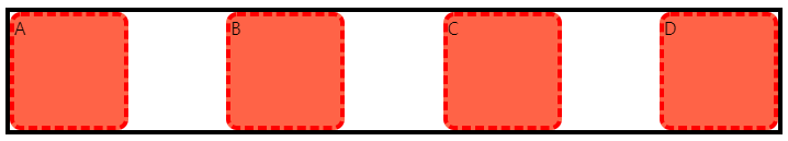
justify-content: space-between;
flex로 지정된 박스 내부의 아이템들 간의 간격을 일정하게 유지합니다.
첫번째 아이템과 마지막 아이템은 한 면이 flex 박스와 인접하게 있습니다.
justify-content: space-around;
flex로 지적된 박스 내부의 아이템들 양 옆에 margin을 부여한 듯하게 일정한 간격으로 유지됩니다.
'CSS' 카테고리의 다른 글
| grow (0) | 2022.04.14 |
|---|---|
| order (0) | 2022.04.14 |
| align-content (0) | 2022.04.14 |
| align-items (0) | 2022.04.14 |
| background-attachment: fixed (0) | 2022.04.14 |
UP NEXT : CSS


댓글
© 2018 webstoryboy